We’ve said it countless times before but branding is one of the most important parts of your company.
An iconic logo is what people will remember. Just think of McDonalds‘ classic golden arches and Apple‘s logo. They are well-design and and as soon as you see them they are instantly recognizable.
Now let’s take a look at some rather questionable logos and wonder what exactly was going through the designer’s head when they conceived these abominations.
You can see more logo disasters here – 25 Epic Logo Design Fails
This Catholic school logo
![]()
Source | Report
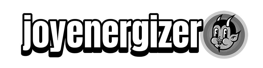
My son who just started to read “HELL BABY. HELL BABY. HELL BABY!!!”
![]()
Source | Report
Now that’s just a bad logo. Period.
![]()
Source | Report
I love drinking kids too!
![]()
Source | Report
Not the greatest logo
![]()
Source | Report
a “cheerleading” logo in a town close to me
![]()
Source | Report
Unfortunate door/logo placement on this plane
![]()
Source | Report
Unappealing prizes on offer at the clinic
![]()
Source | Report
An unfortunate logo for a fitness center
![]()
Source | Report
They really need a new logo…
![]()
Source | Report
There is an extra “R”, normal name is Chuck Burger
![]()
Source | Report
This medical centre’s logo is a flat line
![]()
Source | Report
Is it an elevator or gallows? You can’t be sure
![]()
Source | Report
Jingleheimer Junction, Cartridges for Kids Logo
![]()
Source | Report
Just another restaurant logo that was edgy and cool in someone’s head. Spotted near my gym, Midtown Manhattan
![]()
Source | Report
3lJE or Blue?
![]()
Source | Report
This logo of a company in my city
![]()
Source | Report
This companies logo looks like somebody got pulled into a lathe
![]()
Source | Report
The second line of this logo did not age well
![]()
Source | Report
Whoever designed this logo made a terrible mistake
![]()
Source | Report
Designer: Can you describe the logo you’d like? Client: It should have a leaky pipe. But instead of fixing it, our plumber just puts his finger in there. And btw, it should still leak after he does that
![]()
Source | Report
Design of the bottle and logo looks way to close to a Sunny D like drink. If a kid couldn’t read this would go bad
![]()
Source | Report
A clothing tag with unfortunate logo design…
![]()
Source | Report
THE TIM HOE USE – Supposed to say ‘The Time House’
![]()
Source | Report
The logo for this spicy apple jelly
![]()
Source | Report
his restaurant’s logo that looks like a health grade
![]()
Source | Report
CHONOO ZENDLE Noodle Bar
![]()
Source | Report
It really feels like the Packers logo could have replaced a different letter here…
![]()
Source | Report
Saw this at my local HEB. It’s supposed to say “Frescura” (Freshness)
![]()
Source | Report
Ride on a Space Eship
![]()
Source | Report
ke LEBAB. Restaurant in Stockholm
![]()
Source | Report
This pub is supposed to be called “bunch of grapes” and i saw this unreadable logo and asked my mate “how far is the pub then?”
![]()
Source | Report
This sign on the office building where I’m attending
![]()
Source | Report
Someone put up this sign on a corner near me
![]()
Source | Report
This yogurt using biohazards symbol as its logo
![]()
Source | Report
They didn’t think their logo design through too well
![]()
Source | Report
The actual logo of a school near me
![]()
Source | Report
Was stuck behind this unfortunate logo today
![]()
Source | Report
This logo for “Old Town North”
![]()
Source | Report
This horrific cafe logo
![]()
Source | Report
Girls’ water polo team logo
![]()
Source | Report
This logo of a Turkish water brand
![]()
Source | Report
We’re going to contact them with a new logo hopefully
![]()
Source | Report
Found at the Austin airport – it’s Texas like!
![]()
Source | Report
The flip zone has a rule of “NO BACKFLIPS” when there is literally a guy backflipping in the logo
![]()
Source | Report
Ole let y, no matter how I read this I will always have questions
![]()

